Visualizing and Analyzing Bicycle Infrastructure using OSMnx
Published:
I’ve commuted by bicycle for over 6 years. After moving to Chicago for graduate school, I quickly came to appreciate the dedicated lakefront bike trail. Bike trails and bike lanes make commuting much safer and more enjoyable. However, some cities do a better job than others at building this infrastructure. The goal of this project is to visualize cycleway networks and find the most and least bikeable US cities. Check out the Github repo here!
As a quick side note, I’m not an urban planning researcher or spatial scientist! I’m getting my PhD in Psychology right now. But as a cyclist and data scientist, this seemed like a really interesting problem to tackle in Python. For information from a more reputable source, checkout People for Bikes who do some interesting work on ranking cities’ bikeability.
Creating the Cycleway Map
To get started, I had to find a way to interface with OpenStreetMap, which is basically an open-source Google Maps with specific cycleway information. After some searching, I found the amazing OSMnx library by Geoff Boeing, a professor of Urban Planning at USC. This library allowed me to query the OSM, and also includes network analysis tools.
As an example of how easy it is to access OSM data, here’s a snippet of code that produces the network of all public roads in the city of Chicago, IL:
import osmnx as ox
roads = ox.graph_from_place('Chicago,IL',network_type='drive')
ox.plot_graph(
	roads,
	node_size=0,
	edge_linewidth=.25,
	edge_color='dimgrey')
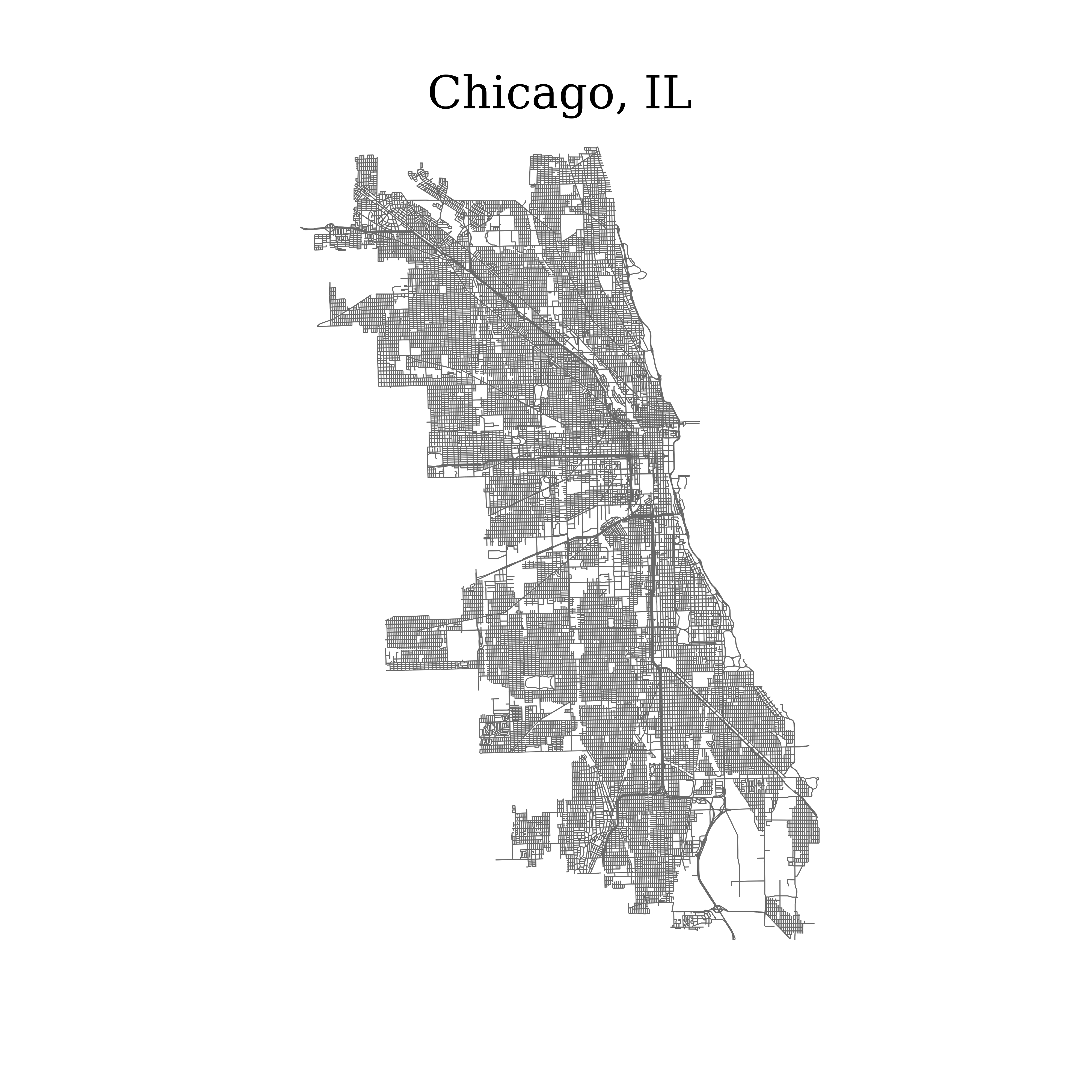
When I first saw this map it really hit me how powerful this database is and how user-friendly OSMnx is. The next challenge was to query for bike infrastructure. It’s a bit more complicated, because I wanted dedicated bike trails as well as bike lanes (collectively referred to as cycleways). This Github thread gave me the answer:
# Configuring osmnx
useful_tags = ox.settings.useful_tags_way + ['cycleway']
ox.config(use_cache=True, log_console=True, useful_tags_way=useful_tags)
# Querying for roads and bike trails
cycleways = ox.graph_from_place(query = city_name, network_type='bike', simplify=False)
# Finding all non-cycleways in the network
non_cycleways = [(u, v, k) for  u, v, k, d  in  cycleways.edges(keys=True, data=True) if  not ('cycleway'  in  d  or  d['highway']=='cycleway')]
# Remove non-cycleways and isolated nodes
cycleways.remove_edges_from(non_cycleways)
cycleways = ox.utils_graph.remove_isolated_nodes(cycleways)
That was pretty much the most complicated code in this project, and I didn’t even have to write it! I stuck that code in a function called get_cycleways(). Here’s what the cycleways look like plotted, including a footprint of the whole city:
# Get footprint of entire city
city_area = ox.geocode_to_gdf(city_name)
# Get cycleways network
cycleways = get_cycleways(city_name)

# Plotting
fig, ax = plt.subplots()
city_area.plot(ax=ax, facecolor='gainsboro')
ox.plot_graph(
	cycleways,
	ax=ax,
	node_size=0,
	edge_linewidth=.85,
	edge_color='limegreen')
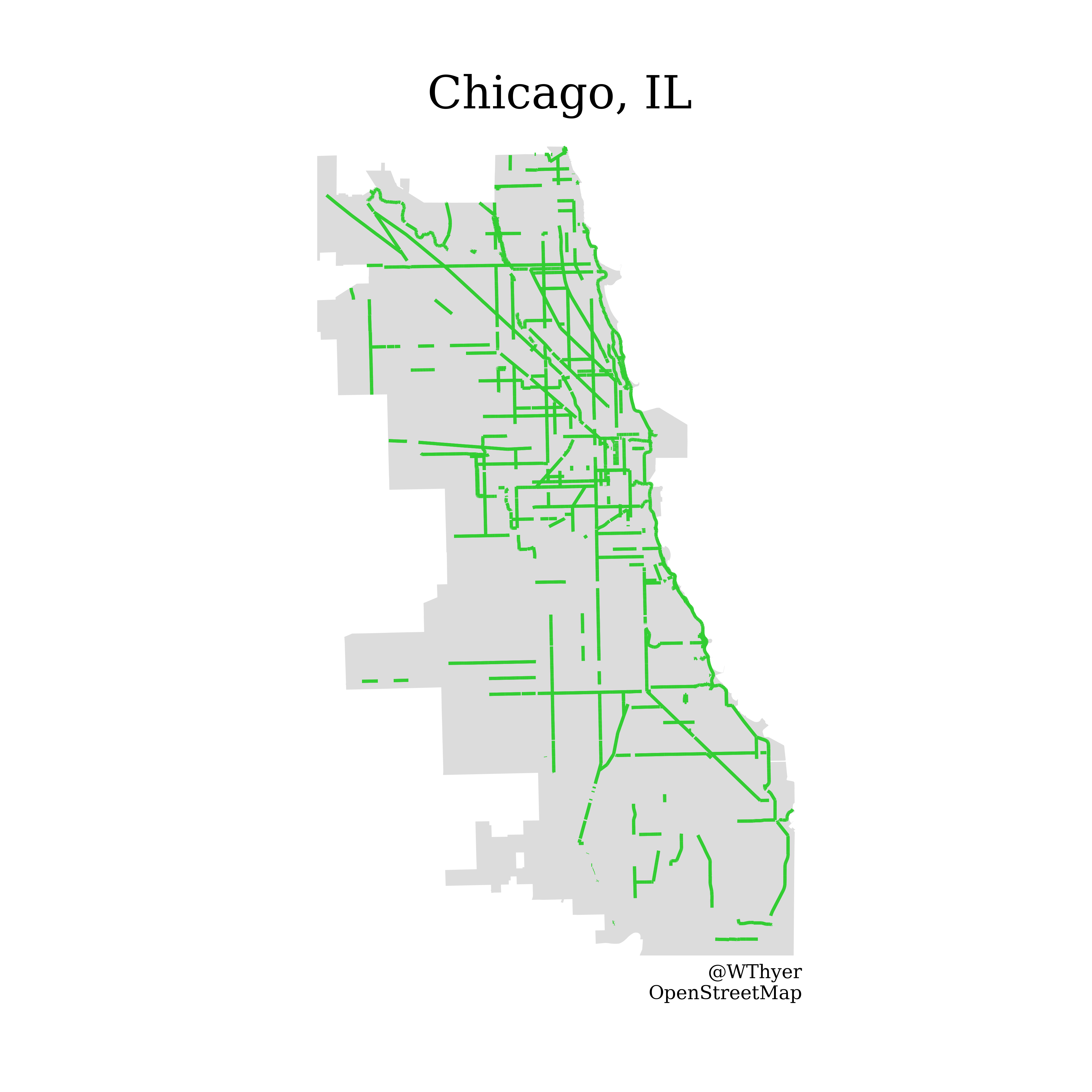
Awesome! All of the query code went into one function called get_city. I also made a function called plot_cycleways that handles all of the plotting. Here’s what that looks like in action:
# load city info and calculate road to cycleway ratio
city_name =  'Chicago, IL'
cycleways,roads,city_area = get_city(city_name)

# create the map
fig,ax = plot_cycleways(
	city_name=city_name,
	cycleways=cycleways,
	roads=roads,
	city_area=city_area)
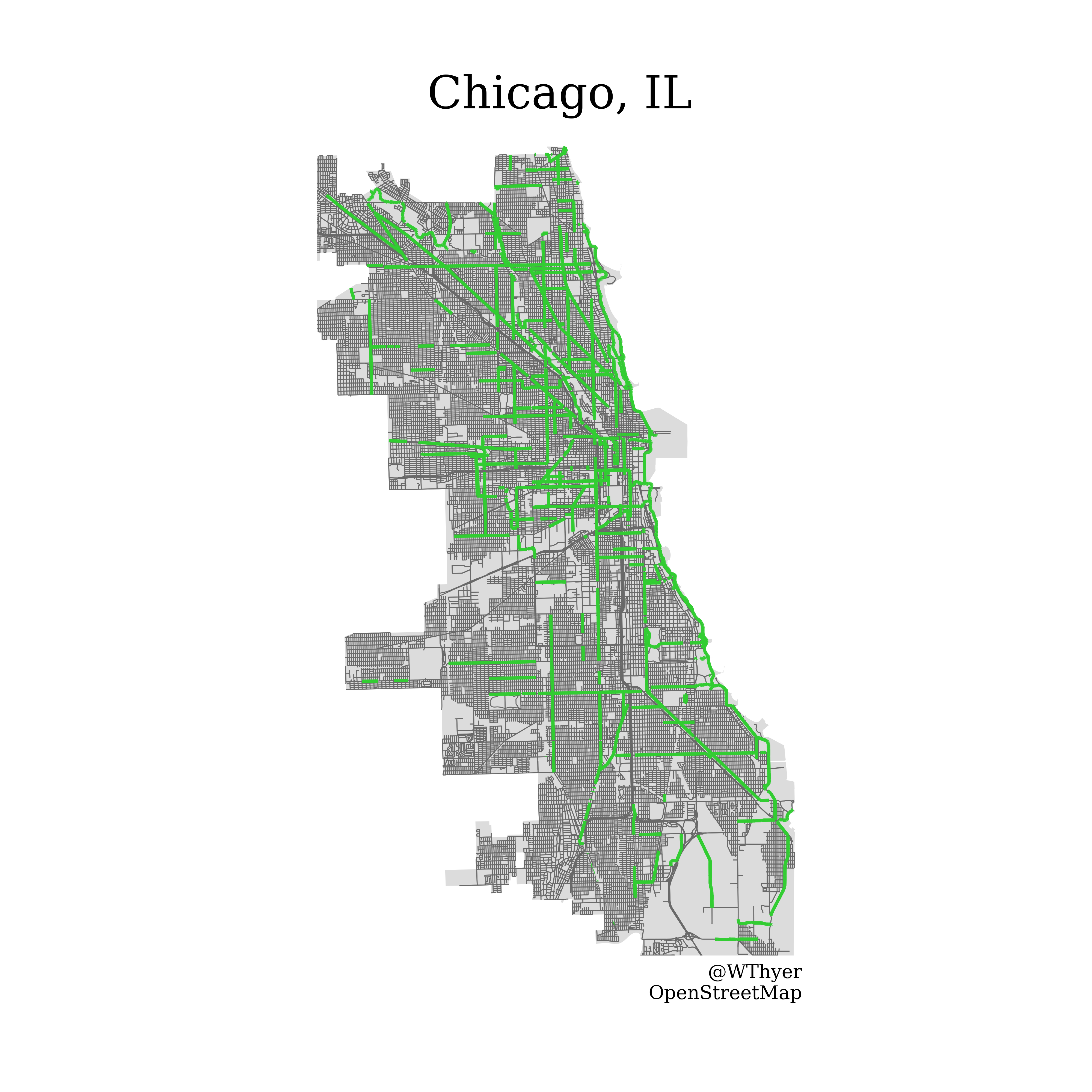
The Best and Worst Bike Cities
My next goal was to find the best and worst bike infrastructures in major U.S. cities. I’m sure there are a lot of interesting network connectivity analyses I could use to quantify the quality of cycleway network, but I won’t attempt those for now.
For the time being, I decided a very straightforward approach would just be to calculate the ratio of roads to cycleways. If the ratio is 1:1, that means there’s as much driving infrastructure as there is bike infrastructure. What a dream!
To implement this, I used an OSMnx function called basic_stats. This returns useful info including the total length of the network edges. I can find the total length of the road network and bike network (in KM), and then calculate the ratio from that:
cycleways_stats = ox.basic_stats(cycleways)
roads_stats = ox.basic_stats(roads)

cycleway_length = cycleways_stats['edge_length_total']
roads_length = roads_stats['edge_length_total']

rc_ratio = roads_length/cycleway_length
I put that in a function called calc_road_cycleway_ratio. Using the pipeline altogether is as simple as this:
city_name =  'Chicago, IL'
# load city info and calculate road to cycleway ratio
cycleways,roads,city_area = get_city(city_name)
road_cycleway_ratio = calc_road_cycleway_ratio(cycleways, roads)

fig,ax = plot_cycleways(
	city_name=city_name,
	cycleways=cycleways,
	roads=roads,
	city_area=city_area,
	road_cycleway_ratio=road_cycleway_ratio)

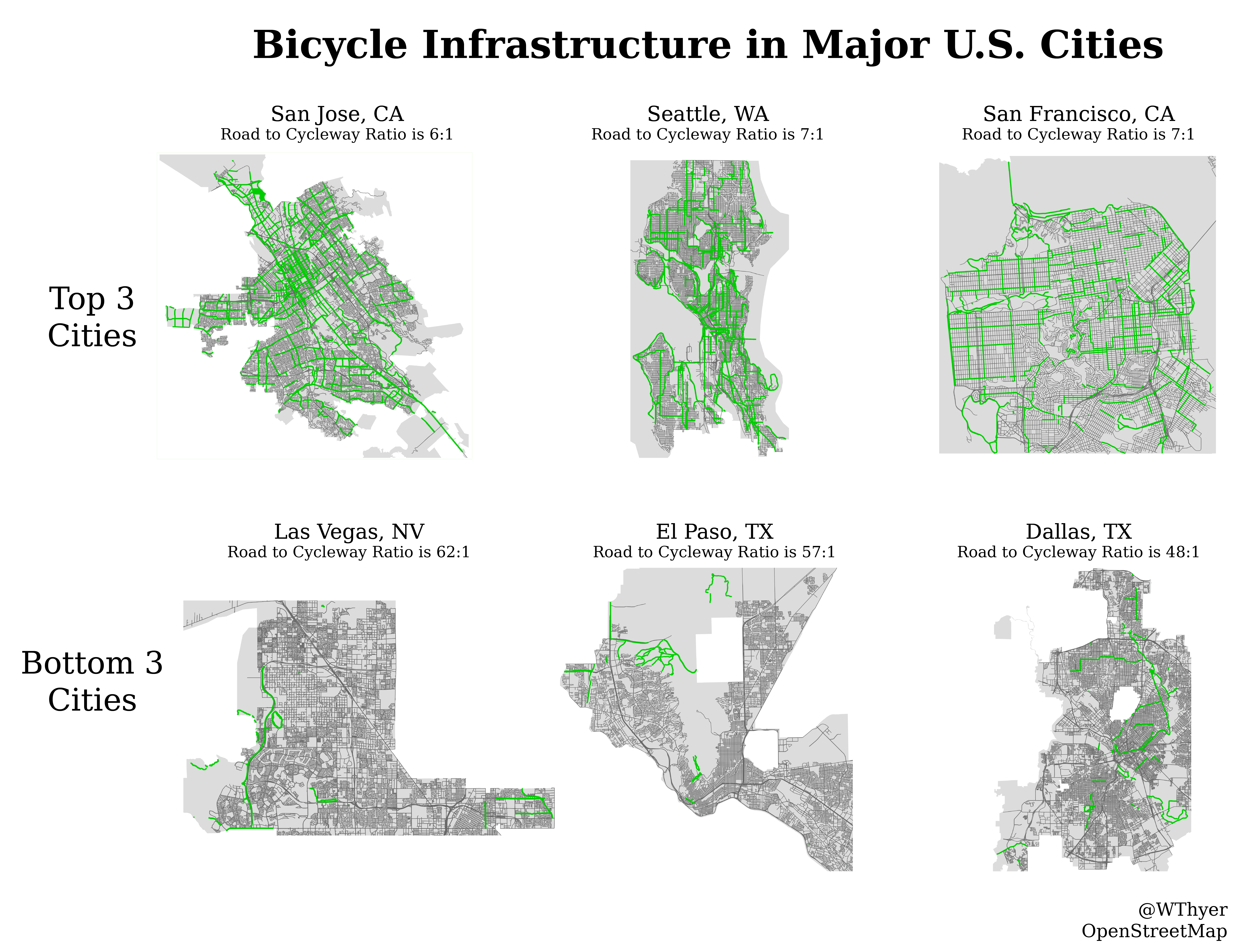
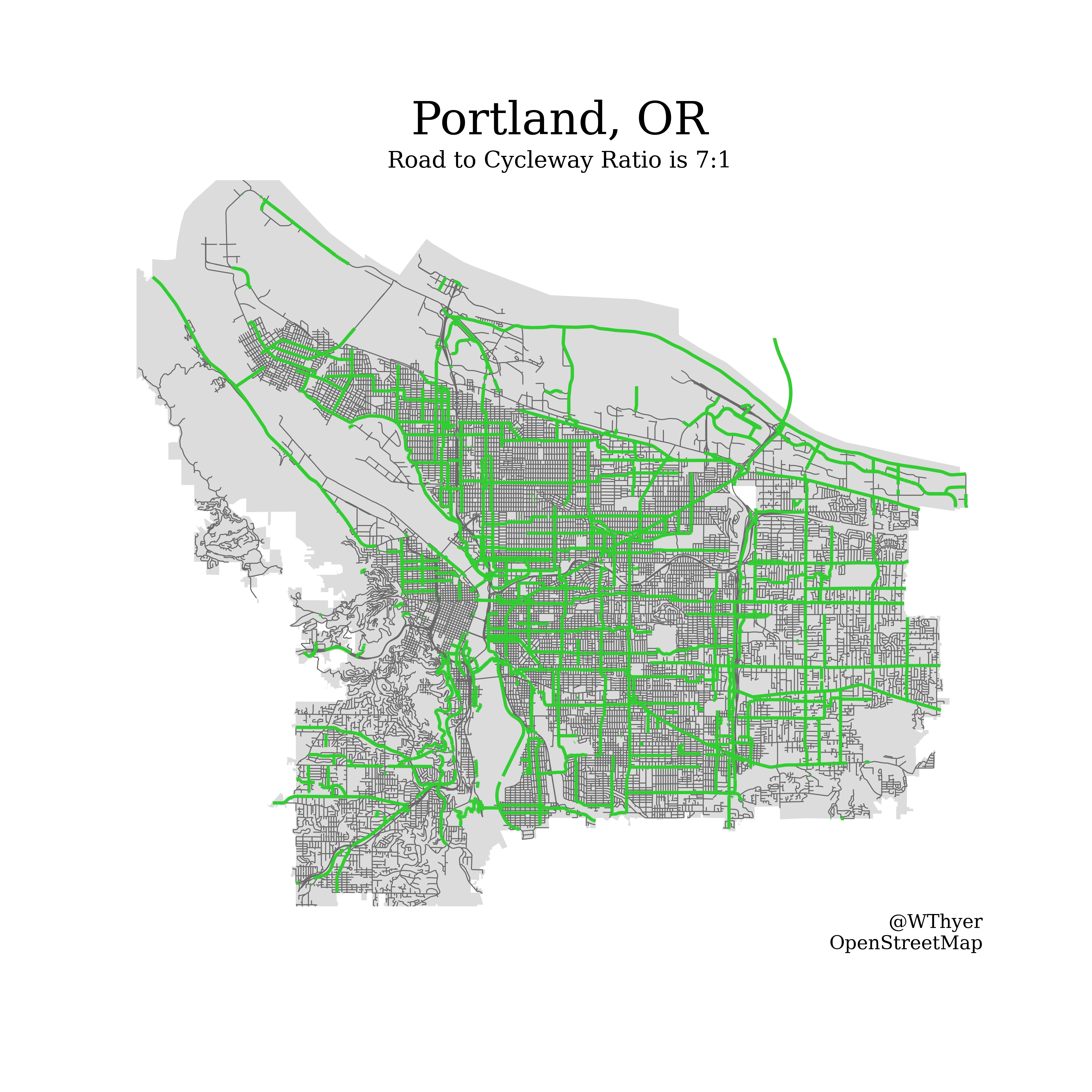
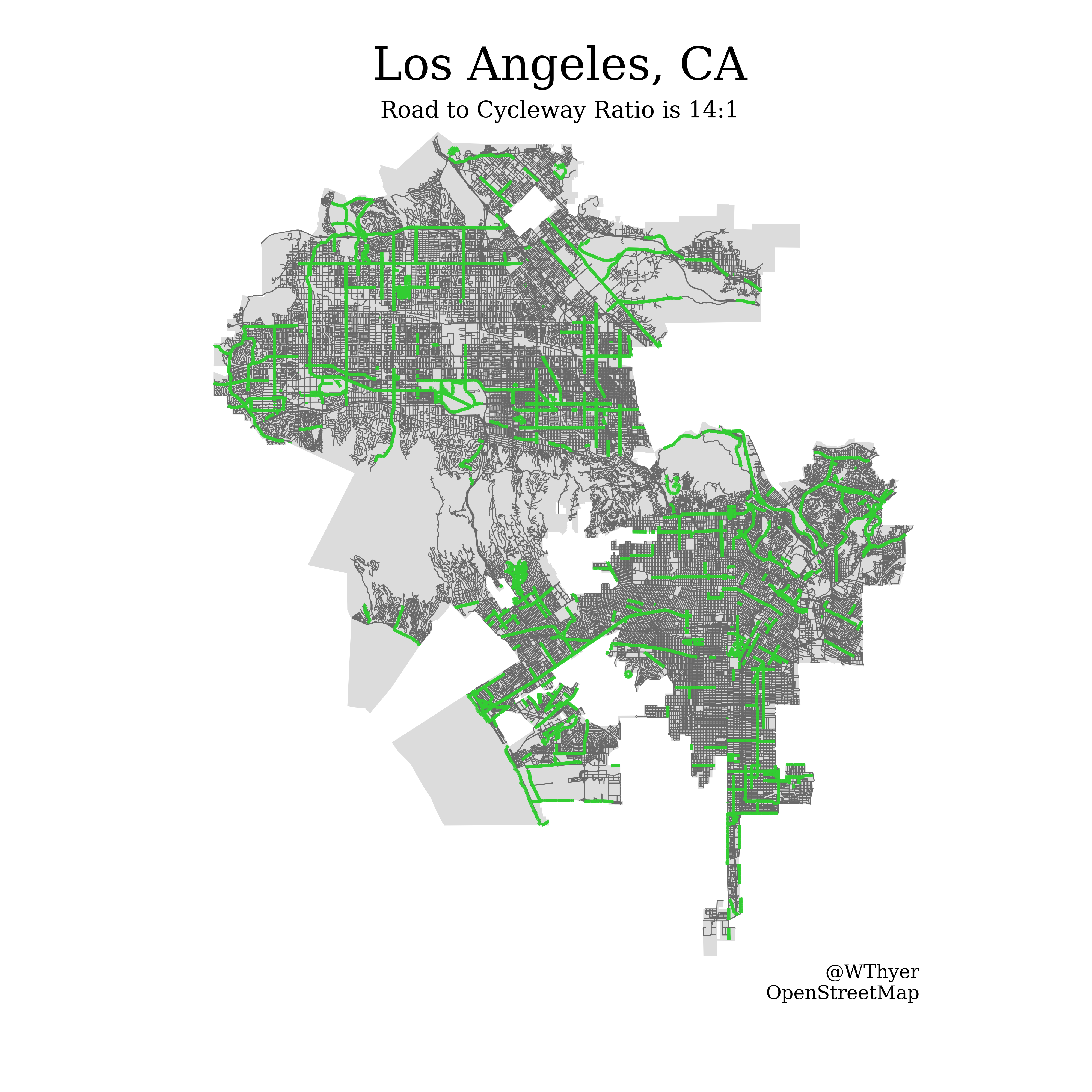
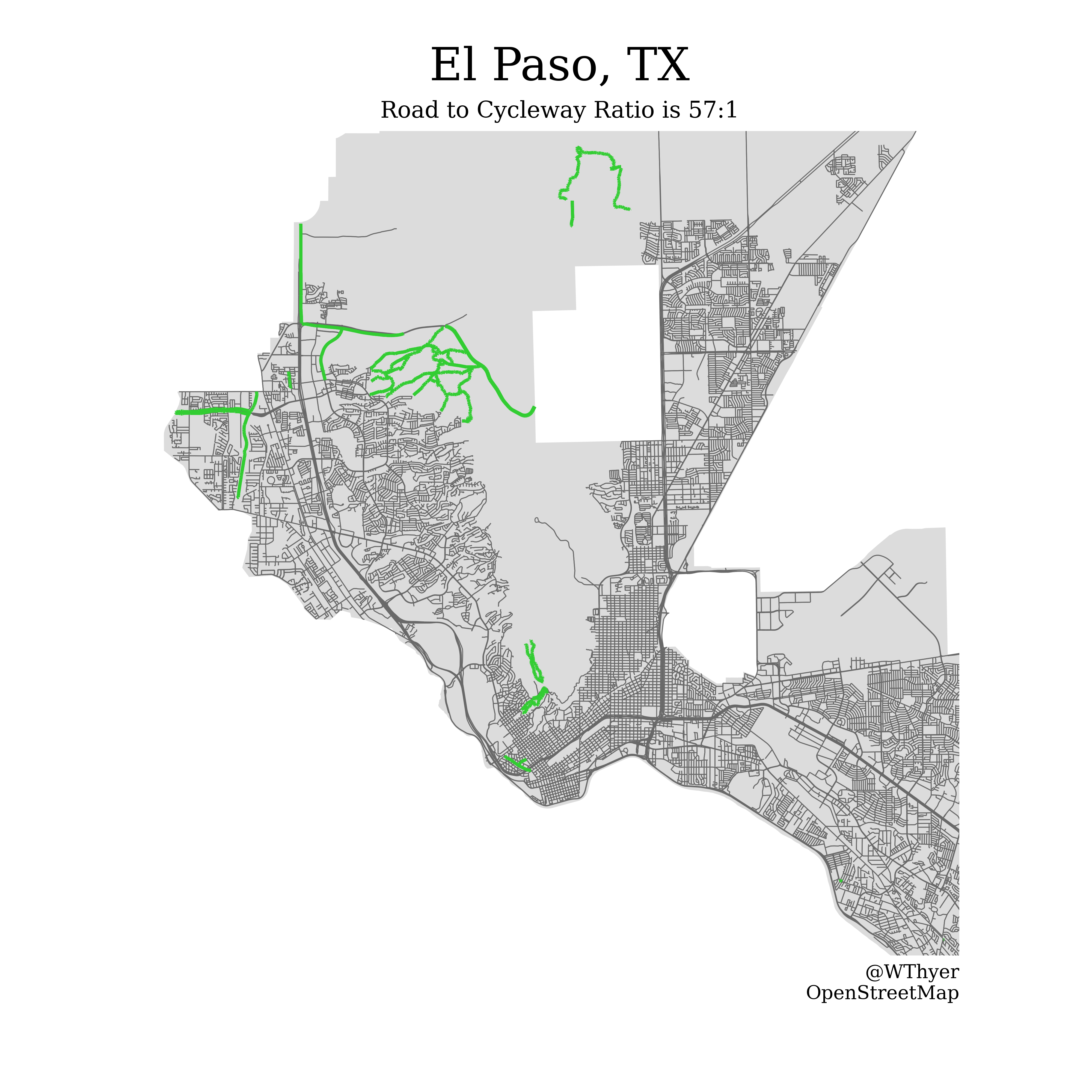
To compare cities, it’s just a matter of inputting the city name and running it through the pipeline. So I decided to start with the top 30 most populous cities in the U.S. Using my road-to-cycleway ratio, here’s the top and bottom 3 cities! It’s not looking good for Texas (although Austin, TX was a close 4th best city).

It looks like my road-to-cycleway ratio is measuring something valid because San Francisco and Seattle are both well-known for their bike culture. And Texas is a very car-oriented state with huge sprawling cities. And as a point of comparison, here’s probably the most famous bike city in the world: 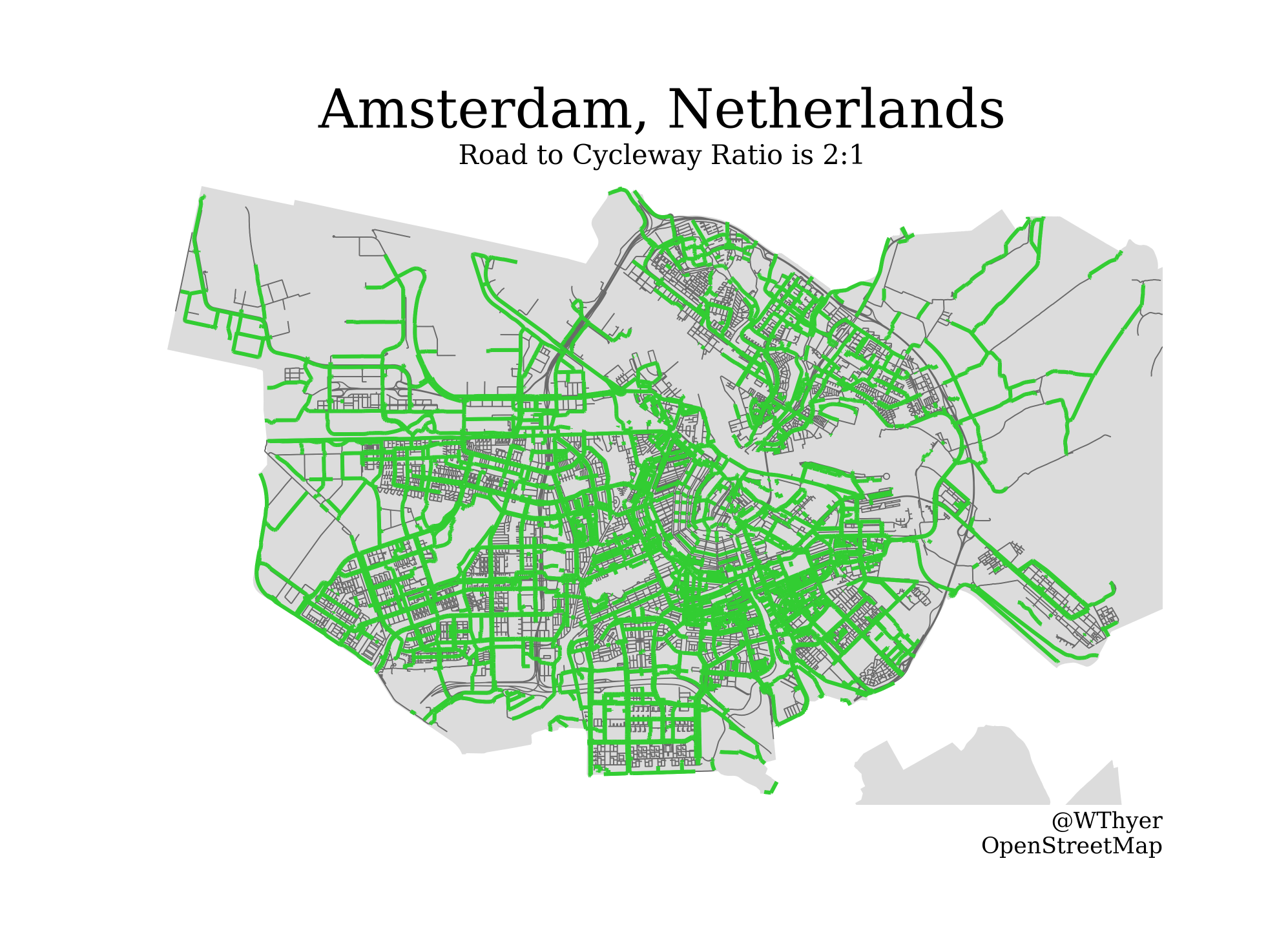
What I Learned
This was an interesting foray into visual story-telling with data visualization. Maps can contain so much information while still being simple to read. Every city map is unique and I had a lot of fun trying out the analysis on different cities. Unfortunately, OSM doesn’t appear to have information about every city (especially those outside of North America and Europe).
I was thrilled that I came up with an idea that was really interesting to me, and there turned out to be a powerful, useable, and well-documented library for it! Python really can be wonderful in that regard. In the future, when I have a task or problem, one of my first steps will be to find if someone else has already solved it.
As I mentioned earlier, there is a whole world of network analyses being applied to maps. It’s an area I’m very intrigued by, but I think this was a great first step. I would also like to include more physical geography in the maps such as bodies of water and green spaces. I’ll leave that for a future project.
Here’s a bunch of other example maps from the top 30 most populous U.S. cities. And here’s a complete collection of maps I’ve generated. 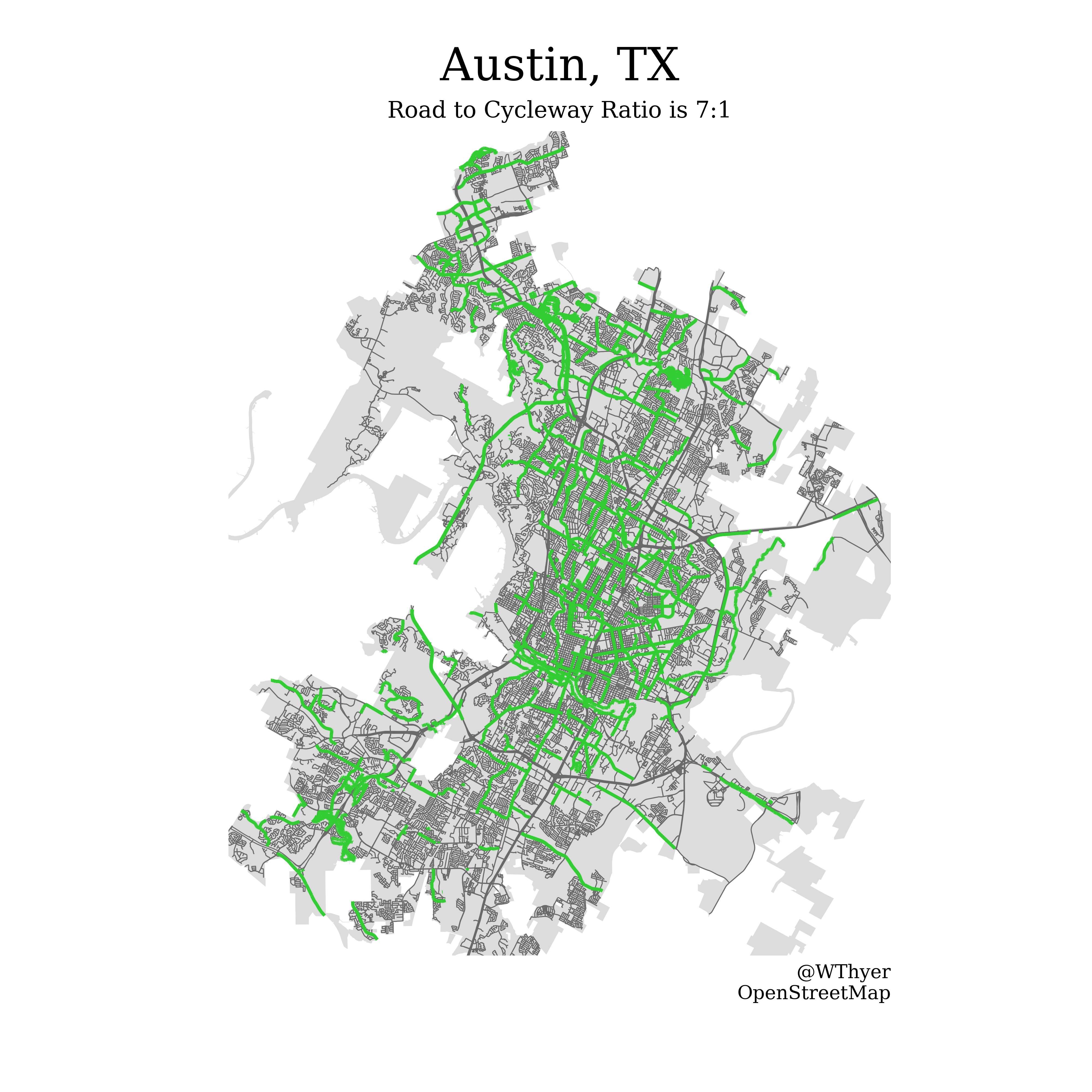


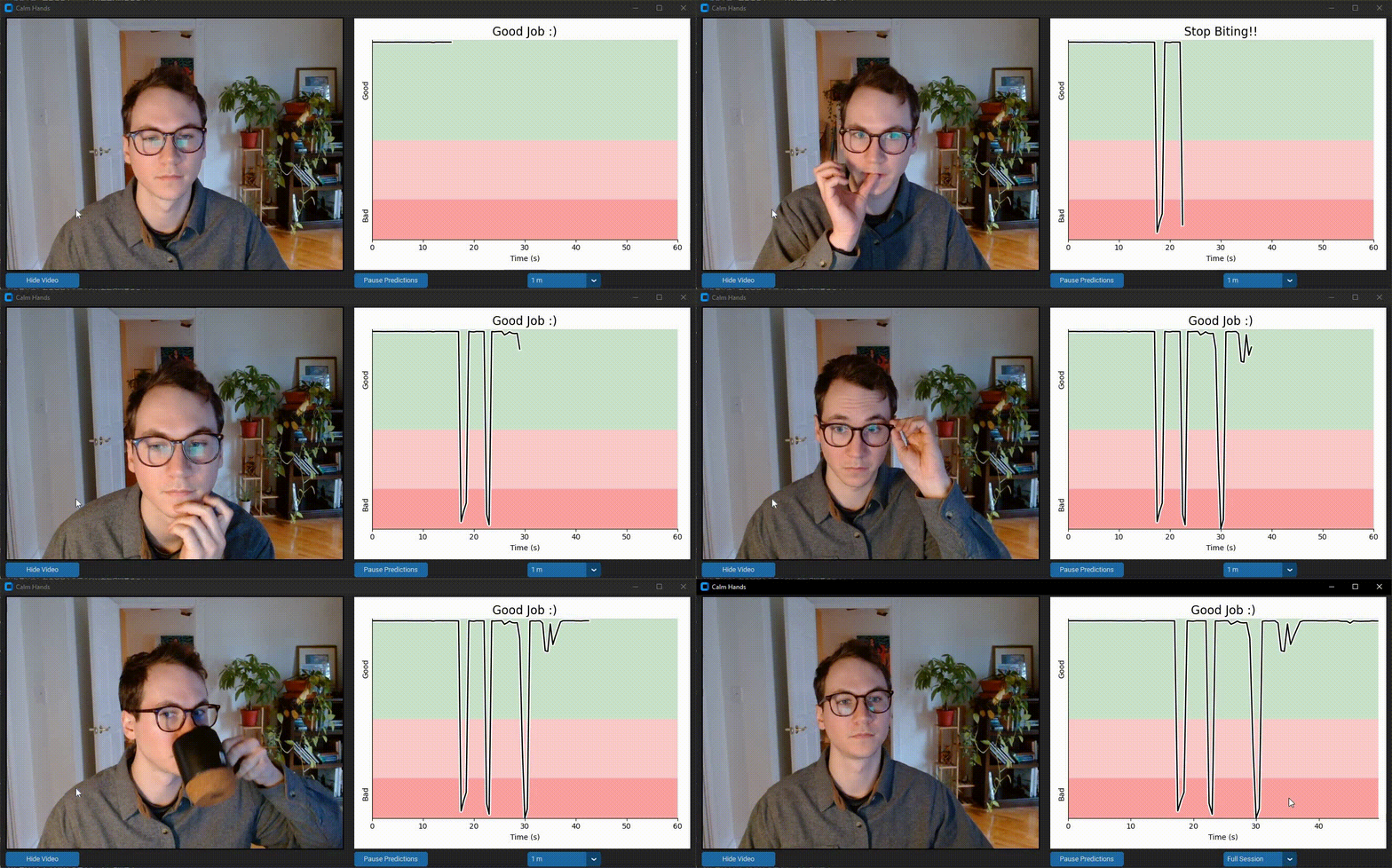 Calm Hands helps the user reduce nail-biting during computer use. It provides realtime feedback about nail-biting habits using a deep neural net that monitors images from your webcam stream. This process is entirely local and images are never saved. Feedback is provided through audio and visual cues to alert you of when you are biting your nails. Realtime data visualization is provided as well. Check out the
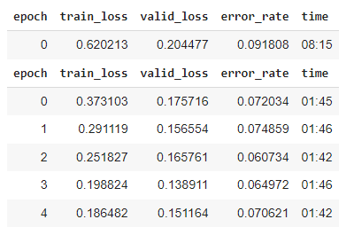 With ~1000 images and 3 cycles of training, I was at >90% accuracy. But I found there were specific positions and angles that the model was getting wrong.