Interactive generative line art app using Bokeh and Numpy
Published:
I created an interactive generative line art creator in Python with the Bokeh library. I was inspired by the “Locations of Lines” artworks by Sol LeWitt I recently saw at the Chicago Museum of Contemporary Art.
Bokeh is great because it allows you to create D3 style interactive plots within Python. So this was a great opportunity to try out the library and get a little creative with Numpy arrays. Before I get into the code, I’ll show the final result:
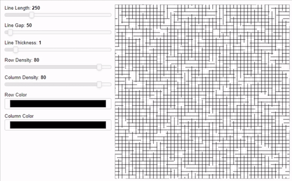
I wanted to be able to modify several aspects of the plot in real time: line length and gap length, line width, row and column density, and the line colors. Updating some of these parameters requires different things happening in the backend. For example, changing line thickness is trivial, but changing line length involves completely modifying the underlying data that is being plotted. This post will outline how it all works. If you want to check out the full code, here’s the repo. The code here differs slightly from the repo since this is just to communicate the basic ideas.
Creating a single row or column of data
First, I’ll outline how I create the data row a single row of lines. Each line needs a start and end point, with each point having an X and Y coordinate. To create the X coordinates, I just need the line length and gap length. Then, with the help of some fancy Numpy indexing, I can create two arrays: the X-coordinates for start of each line and the X-coordinates for the end of each line. The Y coordinates are easy since we’re only creating lines for one row. They’re all just the same row number.
length_row = 1000
row = np.arange(1000)
row_iter = 1
line_length = 250
line_gap = 50

#make each row differ slightly
start_jitter = np.random.choice(np.arange(line_length+line_gap))

#grab coordinates
coordinates1 = row[start_jitter::line_gap+line_length]
coordinates2 = row[start_jitter+line_length::line_gap+line_length]

#make sure coordinate arrays match dimensions
if coordinates1.shape[0] > coordinates2.shape[0]:
    coordinates1 = coordinates1[0:-1]

#combine and transpose
lines1 = np.vstack((coordinates1,coordinates2)).T

#create matching coordinates
lines2 = np.ones(lines1.shape)*row_iter
To create columns of data, I simply swap the X and Y coordinates. Originally I had two sets of functions for creating rows and columns. But I realized they were 99% identical functions so I merged them. With some tweaks, I stuck the above code in a function called _generate_row_col_lines().
Creating all rows/columns of data
Next, I needed to go row-by-row and create each row of data. Here’s where row and column density come into play. Basically, I wanted to be able to manipulate how close each row/column was to each other. This is easily implemented by iterating over the rows while using the density as the step size. So, create one row, skip 4, and create another. I love Numpy.
for row in rows[::row_density]:
    if row == 0:
        lines1,lines2 = _generate_row_col_lines(row)
    else:
        a,b = self._generate_row_col_lines(row_col)
        lines1 = np.concatenate((lines1,a))
        lines2 = np.concatenate((lines2,b))
    lines1,lines2 = lines1.tolist(),lines2.tolist()
I put the above lines in a function called _generate_all_lines(), then put everything into a class called LineFactory.
Plotting with Bokeh
Okay, so now that I have the data, I want to plot it. Bokeh is very well-documented, so plotting was pretty easy. I have experience in Matplotlib, ggplot2 in R, and MATLAB plotting, so I feel pretty confident going into new plotting libraries.
First I create the LineFactory class, then setup the data. For plotting, I used the MultiLine function to plot all of the rows at once. Then a second call plots all of the columns.
# create instance of class
lines = LineFactory(
    line_length=250, line_gap=50,
    column_density=80, row_density=80)

# setup data
horizontal_source = ColumnDataSource(data=dict(
    horizontal_lines_xs=lines.horizontal_lines_xs,
    horizontal_lines_ys=lines.horizontal_lines_ys))

vertical_source = ColumnDataSource(data=dict(
    vertical_lines_xs=lines.vertical_lines_xs,
    vertical_lines_ys=lines.vertical_lines_ys))

# Set up plot
plot = lines.create_figure()
horizontal_lines = plot.multi_line(xs = 'horizontal_lines_xs', ys='horizontal_lines_ys',source=horizontal_source,line_width=1,color='black')
vertical_lines = plot.multi_line(xs = 'vertical_lines_xs', ys='vertical_lines_ys',source=vertical_source,line_width=1,color='black')
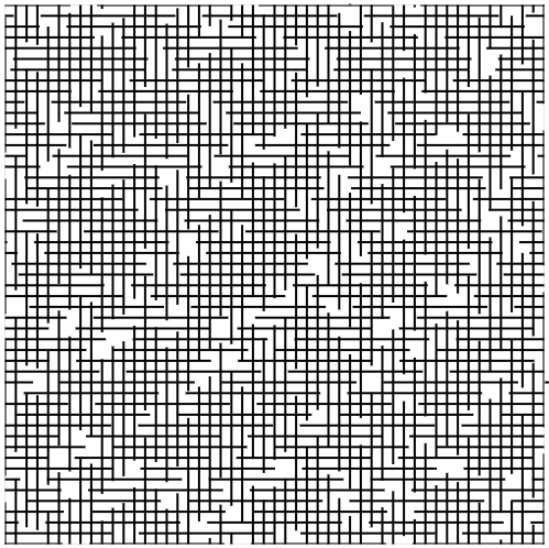
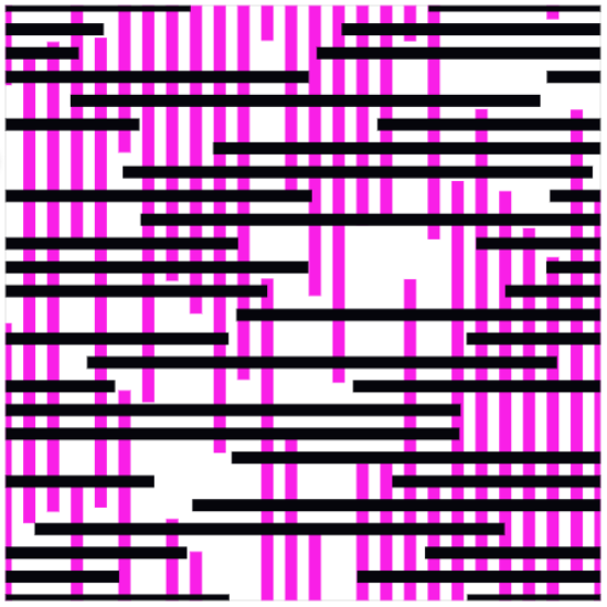
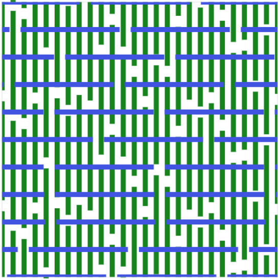
Alright, here’s our default plot! Looks a bit like the original artwork I saw by Sol LeWitt. Now to make it interactive!
Adding interactivity using Bokeh server
Here’s the really interesting part. The Bokeh server allows me to create a plot with widgets that implement code to update the data that is being plotted. Changing line length, gap length, and density requires the data to be updated on-the-fly as the widget is used. The color picker and line thickness are much easier to implement since they are just plotting aesthetics.
First, I create the widgets that will affect the underlying data being plotted.
# data widgets
line_length = Slider(title="Line Length", value=250, start=0, end=1000, step=10)
line_gap = Slider(title="Line Gap", value=50, start=0, end=1000, step=10)
row_density = Slider(title="Row Density", value=80, start=0, end=90, step=10)
column_density = Slider(title="Column Density", value=80, start=0, end=90, step=10)
And then create an update function that updates the data for the plot as the widget’s value is changed.
# Set up callbacks
def update_data(attrname, old, new):

    # Get the current slider values
    ll = line_length.value
    lg = line_gap.value
    rd = row_density.value
    cd = column_density.value

    lines.make_lines(ll,lg,rd,cd)

    horizontal_source.data = dict(
        horizontal_lines_xs=lines.horizontal_lines_xs,
        horizontal_lines_ys=lines.horizontal_lines_ys)

    vertical_source.data = dict(
        vertical_lines_xs=lines.vertical_lines_xs,
        vertical_lines_ys=lines.vertical_lines_ys)

for w in [line_length, line_gap, row_density, column_density]:
    w.on_change('value', update_data)
The widgets that affect the aesthetics (line thickness and color) are much easier. Using the jslink, I connected the widgets to the parameters of the lines I wanted to change.
# plotting widgets
row_color_widget = ColorPicker(title="Row Color")
column_color_widget = ColorPicker(title="Column Color")
row_color_widget.js_link('color', horizontal_lines.glyph, 'line_color')
column_color_widget.js_link('color', vertical_lines.glyph, 'line_color')

line_thickness = Slider(title="Line Thickness", value=1, start=0, end=10, step=1)
line_thickness.js_link('value', vertical_lines.glyph, 'line_width')
line_thickness.js_link('value', horizontal_lines.glyph, 'line_width')
Finally I put all of the widgets together with the plot. And curdoc().add_root() sets up the Bokeh server with this Python code running as the backend.
inputs = column(line_length, line_gap, line_thickness, row_density, column_density, row_color_widget, column_color_widget)
curdoc().add_root(row(inputs, plot, width=800))
Then in the terminal. This opens the interactive plot in your default browser.
cd ...\locations_of_lines
bokeh server --show locations_of_lines.py
This was a really fun project. I haven’t ever created an interactive plot before, so this was exciting. I love the idea of using interactive plots to aid in data exploration and model interpretation, so this is a skill I was happy to work on. It also reaffirmed my love of Numpy. The plot would be laggy if I couldn’t update the data over and over extremely quickly, and Numpy made that really easy.
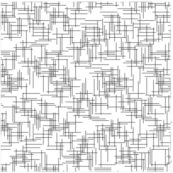
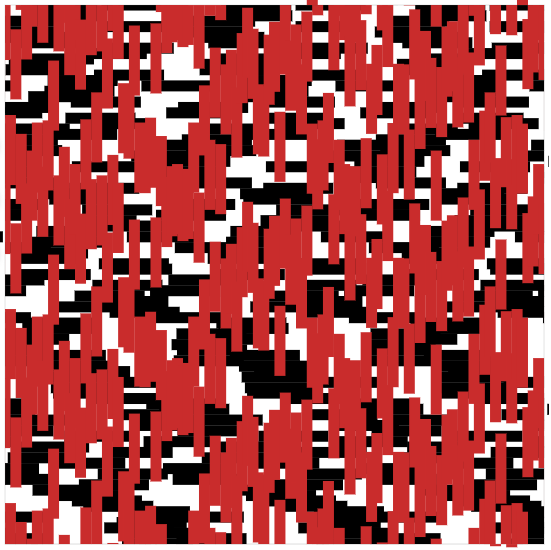
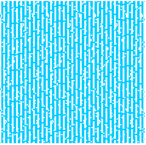
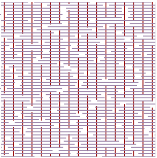
I actually had fun messing around with the app for a while. Here are a few examples of artworks I was able to make with it:
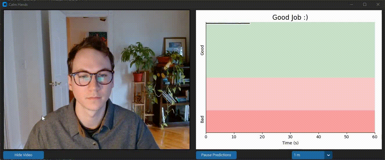 Calm Hands helps the user reduce nail-biting during computer use. It provides realtime feedback about nail-biting habits using a deep neural net that monitors images from your webcam stream. This process is entirely local and images are never saved. Feedback is provided through audio and visual cues to alert you of when you are biting your nails. Realtime data visualization is provided as well. Check out the
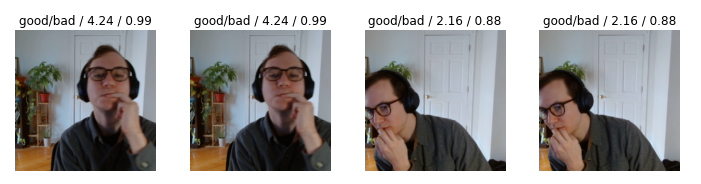
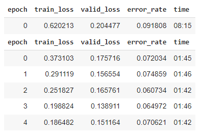 With ~1000 images and 3 cycles of training, I was at >90% accuracy. But I found there were specific positions and angles that the model was getting wrong.