Plotting timecourse of coefficients from EEG classification model using scipy.interpolate and matplotlib.animation
Published:
This post outlines a python script I wrote that takes in coefficients from a series of EEG classification models and projects the coefficients back on the scalp over time using scipy.interpolate and matplotlib.animation.
I’ve wanted an excuse to play around with matplotlib animations and scipy’s interpolation functionality. In the past, I’ve just outputted each frame as a .png and then uploaded them all to a gif-making website… Not ideal!
First, I’ll briefly describe the data I’m working with. These are coefficients from a ordinal logistic regression model that classifies EEG data. EEG is electrical activity recorded from an array of electrodes on the scalp. Without going into too much detail, this model classifies the number of items an individual is holding in their visual working memory. A separate model is trained at each timepoint, with the array of electrodes as the predictors.
After training the models (I’ll make a more in depth blog post about this process at a later date), I extract the coefficients from each subject, each electrode, and each timepoint. That leaves us with this:
print(coefs.shape)
(30, 30, 145, 30)
That is a numpy array of shape: (n_subjects, n_cross_val_iters, n_timepoints, n_electrodes). I also need the x and y coordinates of where the electrodes are placed on the scalp. This allows me to project the 1-D array back into 2-D space. I’ll pick a random timepoint and project the coefficients on the “scalp”. Darker blue means that electrode was more heavily weighted in the model.
plt.figure(figsize=(5,6.7))
coefs = abs(np.mean(np.mean(coefs,1),0)[48])
plt.scatter(chan_locs_y,chan_locs_x,s=100,c=coefs, cmap='Blues',edgecolors='k') #plotting coefficients of electrodes
plt.scatter(0,0,s=70000,marker='o',facecolors='none', edgecolors='k') #plotting "head"
plt.scatter(0,1.3,marker='^',s=750, facecolors='none',edgecolors='k') # plotting "nose"
plt.ylim(-1.5,1.75)
plt.axis('off')
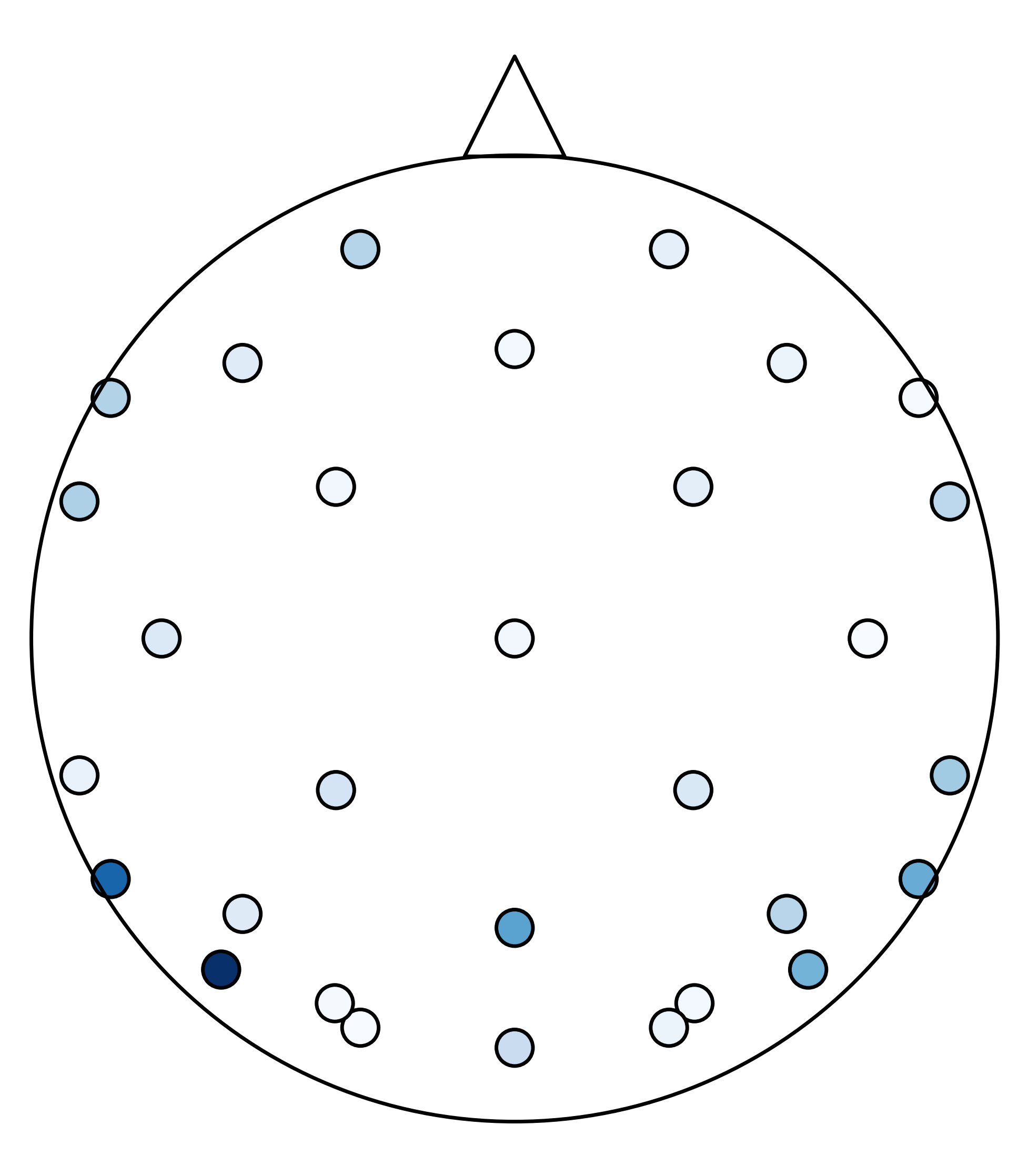
For this plot, imagine you are looking down at the top of someone’s head (the triangle is my attempt at a nose). These points are where the electrodes are placed. You can see how sparse the electrode array is. I will use scipy.interpolate.griddata to interpolate the data between the electrodes for better visualization.
# create grid for interpolation
grid_x, grid_y = np.mgrid[-1:1:1000j, -1:1:2000j]
# calculate average across subjects and cross-val iterations, and grab single timepoint
coefs_avg = abs(np.mean(np.mean(coefs,1),0)[i_timepoint])
# interpolate data across scalp
interp = interpolate.griddata((chan_locs_y, chan_locs_x),coefs_avg,(grid_x,grid_y),method='cubic')
The above code calculates the actual interpolation. I will stick this in a function along with some other basic plotting settings (i.g. removing axes, adding a colorbar, etc).
create_frame(i_timepoint=48, coefs=coefs, timepoints=timepoints,chan_locs_x=chan_locs_x,chan_locs_y=chan_locs_y)
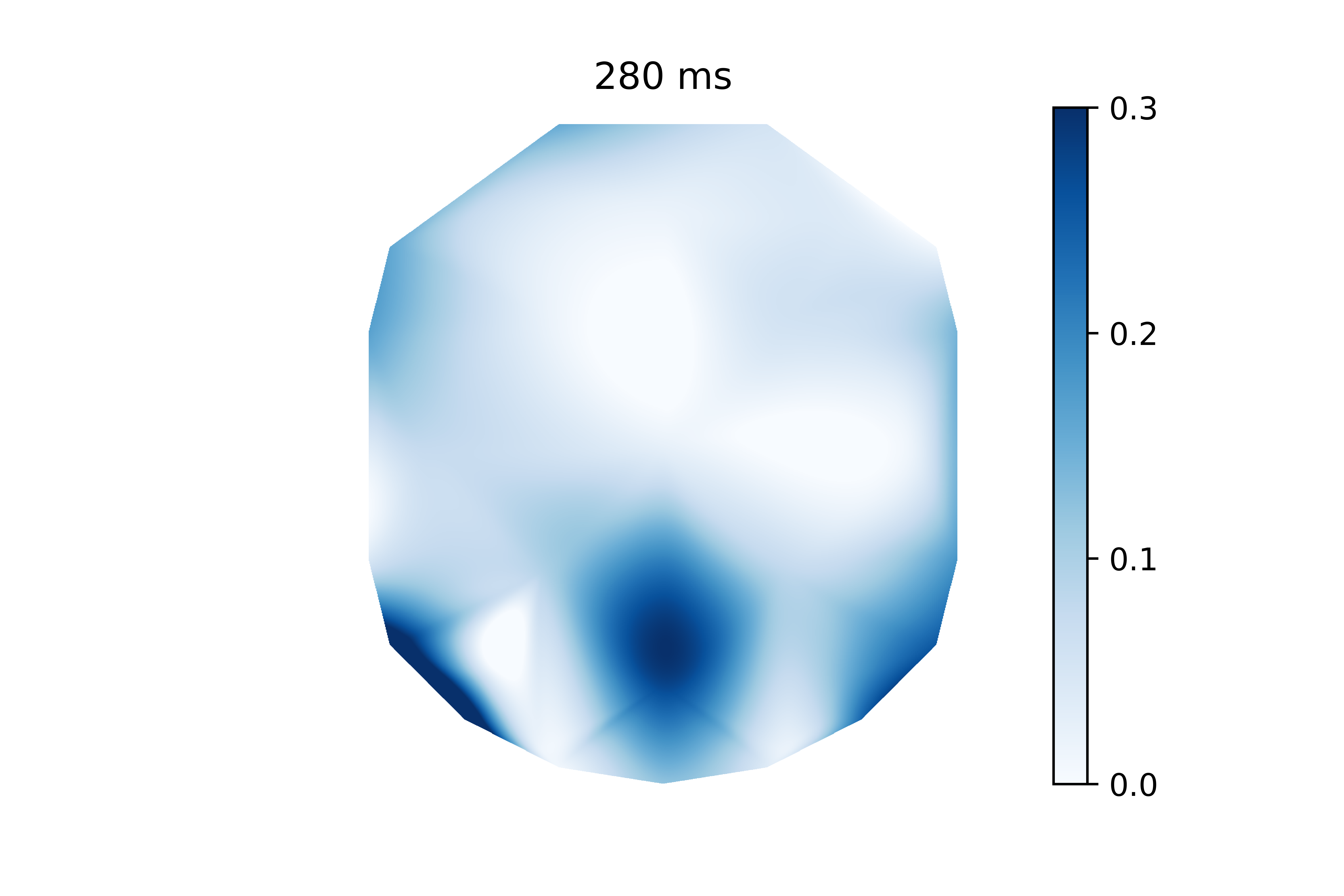
This is the same information as the previous plot, but it’s much easier to visualize. It’s clear that electrodes in the back of the head have higher coefficients than the rest. It’s worth noting that the electrode voltages were z-scored before the model was trained. This allows me to interpret these weights since the electrode voltages have the same scale.
But this is only one frame of data. In reality, this signal develops over time. This is a perfect excuse to use matplotlib’s animation functionality. And the create_frame() function is already setup in such a way to work well with animation.FuncAnimation. First I will create the animator.
fig = plt.figure(figsize=(10,10))
ani = animation.FuncAnimation(fig, create_frame, fargs=(coefs, timepoints,chan_locs_x,chan_locs_y), frames=len(timepoints), repeat=True)
The above code basically passes animation.FuncAnimation a figure, a frame function, the parameters that get passed to the frame function, how many frames the animation should be, and if the animation should loop. Then, I need to create the writer and save the gif.
writer = animation.writers['pillow']
writer = writer(fps=5)
ani.save('coef.gif',writer=writer)
I opted to use Pillow just because I already had it installed. I tested a few frames-per-second and decided 5 was good. Then, I passed the writer to ani and saved the gif as “coef.gif”. Here is the final result below.
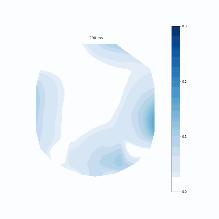
This is an interesting way of assessing my model. It allows me to see which regions of electrodes contribute to the model’s predictions the most at each timepoint. The coefficients are scattered before 0 ms because that is actually before the participant evens sees the memory array. Around 150 ms I can see that rear electrodes are very heavily weighted. Then after around 400 ms this pattern becomes much more distributed.
I suspect variations on this visualization could be useful for any time-series classification/regression model that has spatial information. I’m glad that I tried this project because it got me using two tools I’ve been interested in for a while.
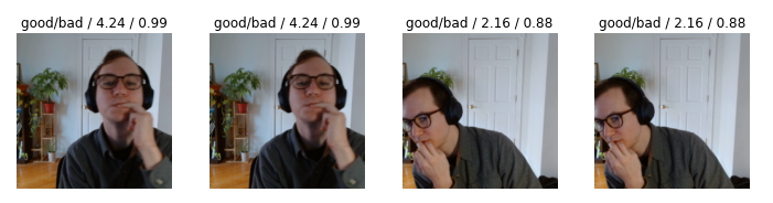
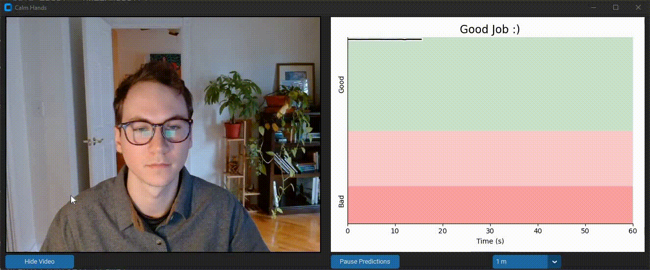 Calm Hands helps the user reduce nail-biting during computer use. It provides realtime feedback about nail-biting habits using a deep neural net that monitors images from your webcam stream. This process is entirely local and images are never saved. Feedback is provided through audio and visual cues to alert you of when you are biting your nails. Realtime data visualization is provided as well. Check out the
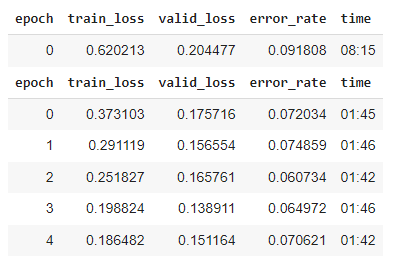 With ~1000 images and 3 cycles of training, I was at >90% accuracy. But I found there were specific positions and angles that the model was getting wrong.